Greenview
Web design • Information architecture
Greenview’s website had stopped describing the company accurately — the messaging, the structure, and the visual language all belonged to an earlier version of the product. I started with a full content and experience audit rather than a visual direction, because "the site feels outdated" is a symptom, and three quite different problems produce it.
Company
Greenview
Role
Product Designer
Year
2025
Background
Greenview’s marketing website had not kept pace with how the company and its product evolved. The messaging, structure, and visual language no longer reflected the maturity of the Greenview Portal or the breadth of the company’s position in the sustainability data space — which made it harder for a prospect to work out what Greenview actually offered.
The brief arrived as a feeling rather than a fault, which is usually how this arrives. A site can feel outdated because its words are wrong, because its structure is wrong, or because its surface is wrong, and those three do not share a fix. So the first deliverable was not a design.
Design Strategy
The work started with a structured audit: every existing page, every piece of content, and every user flow mapped, to pinpoint where messaging clarity, navigation, and visual consistency were falling short. Rather than going straight to visuals, I sorted what I found into three buckets — content problems (unclear or outdated messaging), structural problems (confusing navigation and page hierarchy), and visual problems (inconsistency with the product’s design language) — so each could be answered with the right fix instead of absorbed into a blanket redesign.
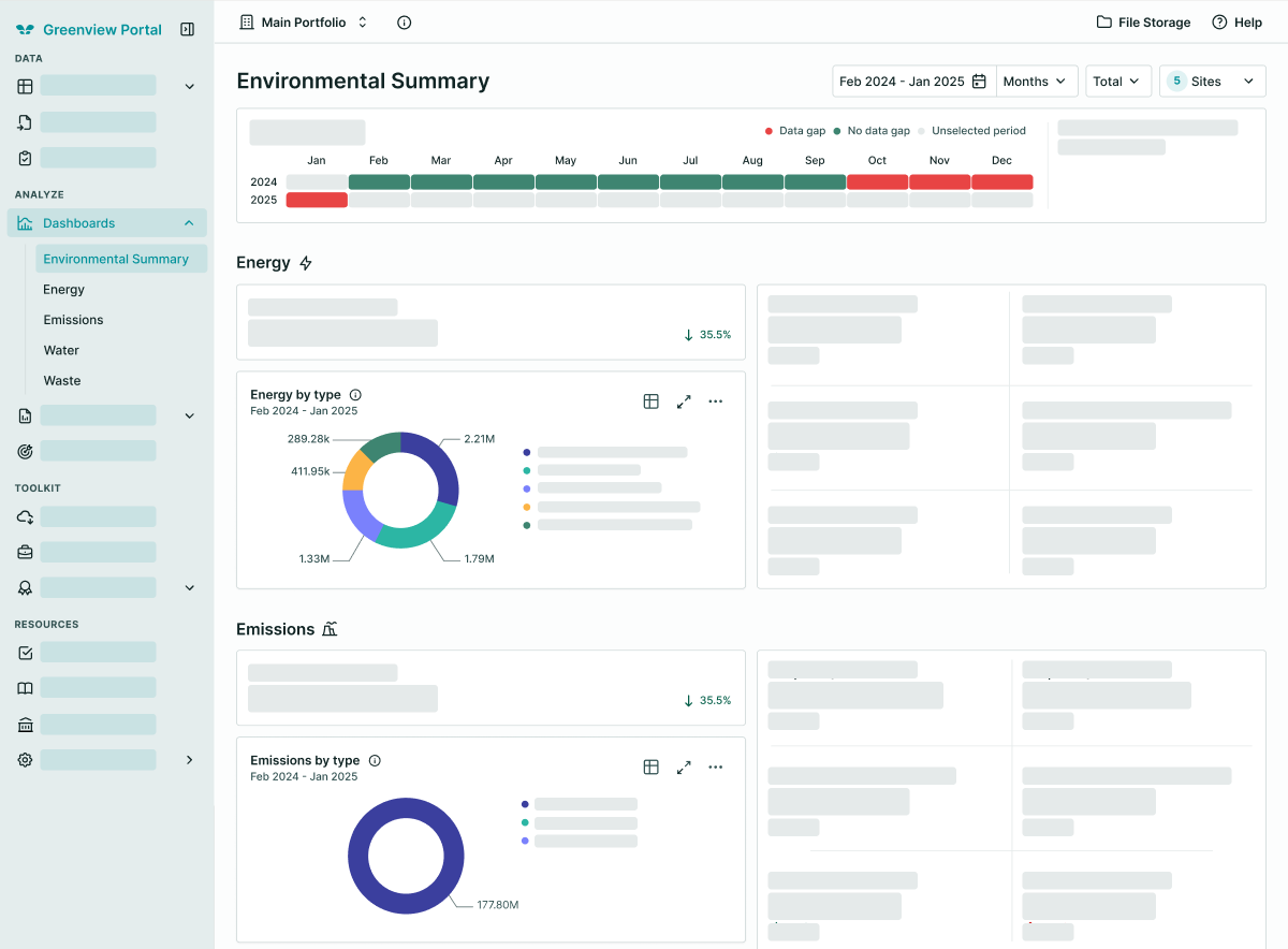
From there, the information architecture: simplifying the navigation, re-sequencing page flows to match how prospects actually evaluate a product, and tightening page hierarchies so the key messages surfaced earlier. On the visual side I aligned the site with the broader brand system, reusing the components, tokens, and iconography already established for the Greenview Portal wherever it made sense, so the site read as an extension of the product experience rather than a separate marketing artefact.
Stakeholders saw it in iterative reviews rather than one big-reveal redesign — audit findings first, to build a shared understanding of the problems, then the structural and content changes, then visual polish. That order is what kept feedback on the right layer at the right time, instead of one session where "this word is wrong" and "this page’s whole structure needs to change" arrive in the same breath and cancel each other out.
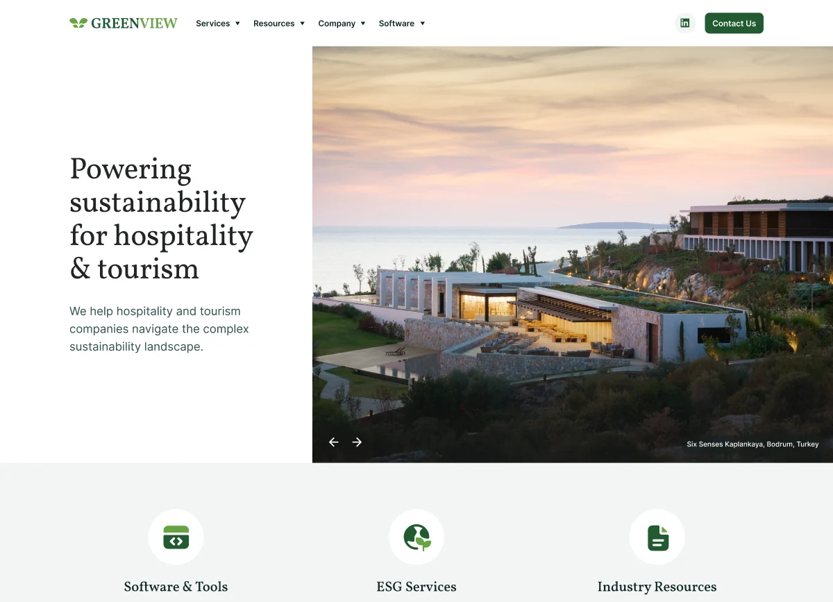
Home
Carries a shortcut into three of the four groups, and none into the fourth.
Services
What Greenview does for a client. Surfaced on the home page as ESG Services.
Resources
Standards, reporting, and industry context. Surfaced as Industry Resources.
Company
Who is behind the work. The one group with no shortcut above it.
Software
The Greenview Portal itself. Surfaced as Software & Tools.
Contact Us
Kept out of the groups and given its own button, so the single action is never a menu item.
Result
The audit became the foundation for a clearer, more coherent website structure, and gave stakeholders a shared, evidence-based view of what needed to change and why — rather than competing opinions about the old site.
That is the part that carried. Once a disagreement was about a documented gap instead of a preference, it could be settled.
Self Reflection
This reinforced how much a good audit de-risks a redesign. Most of the design decisions became obvious once the problems were laid out clearly, which is a flattering result for the audit and a slightly deflating one for the design.
It also sharpened how I translate messy, subjective feedback into concrete design problems. "The site feels outdated" is not actionable. Which of the three layers it is failing on always is.