Greenview Brand Guideline
Design systems • Brand identity
Greenview’s product and its marketing presence grew at the same time and drifted apart while doing it. I audited what was actually in use across both, separated the accidental differences from the deliberate ones, and documented the foundation they should share — built on CSS variable tokens from the start, so what the guideline says and what ships could not disagree.
Company
Greenview
Role
Product Designer
Year
2025

Background
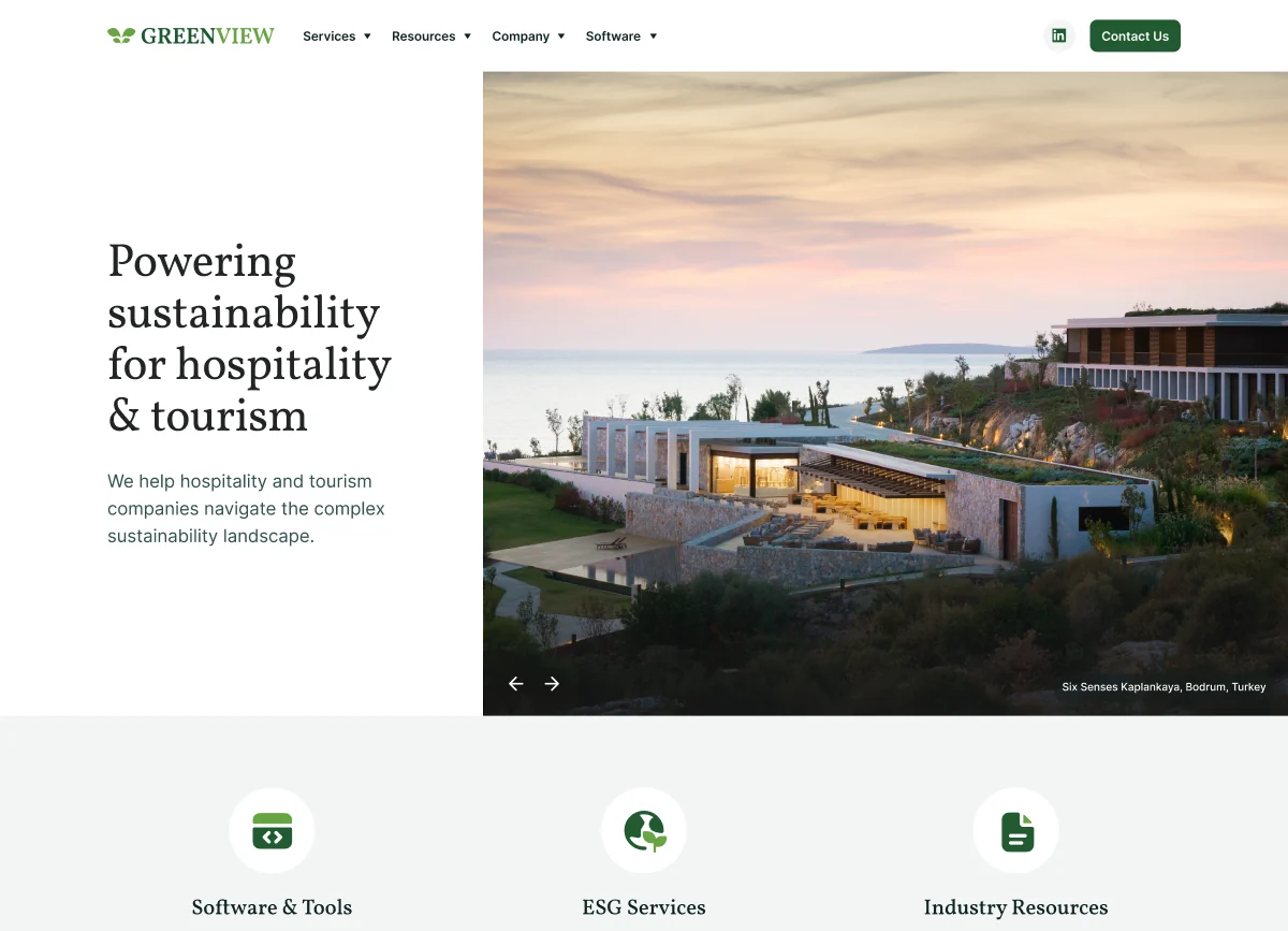
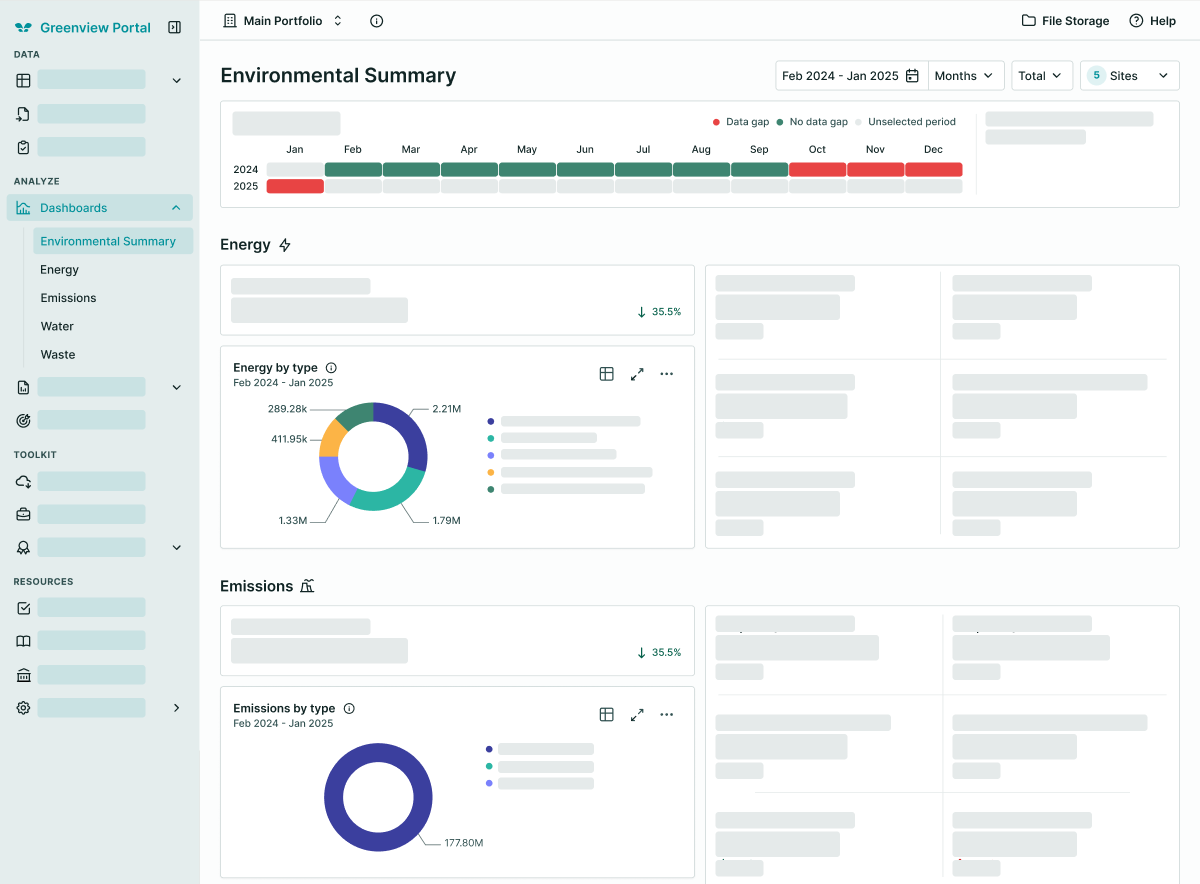
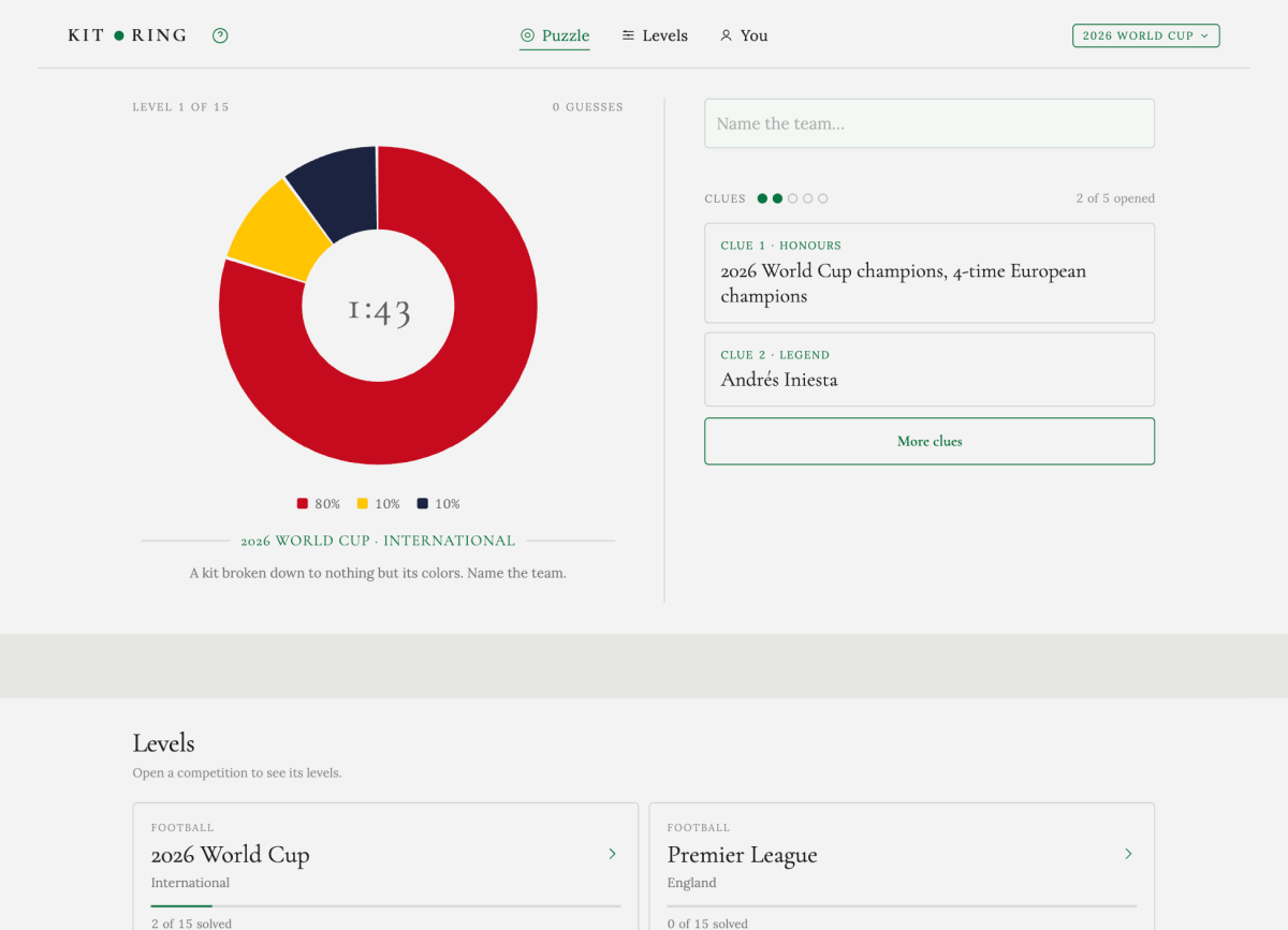
As Greenview’s product and its marketing presence grew in parallel, visual inconsistencies started showing up — different teams making independent decisions on colour, iconography, and typography with no shared reference to check against. The brand felt fragmented across surfaces.
Design Strategy
I started by auditing the visual patterns already in use across product and marketing — colours, type styles, icon usage, spacing — to see where teams had unknowingly diverged, and where the difference was genuine and intentional. Product UI needs a different density from a marketing page. That distinction mattered: the goal was not to force everything into one identical style, but to define what should be shared as a foundation versus what could reasonably flex by context.
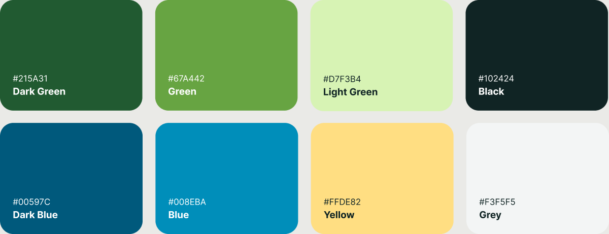
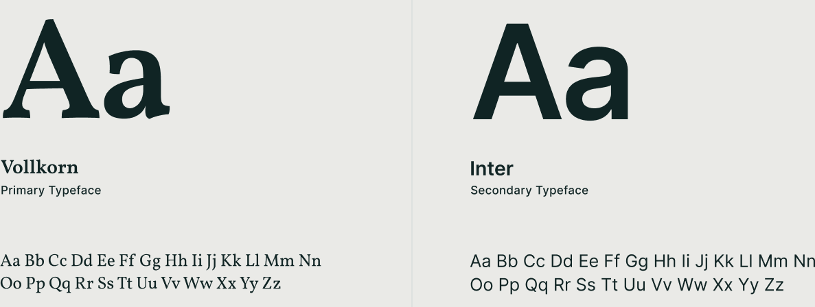
From there I consolidated the shared foundation into a documented system covering colour tokens, a typography scale, iconography standardised on the Tabler set for consistency and coverage, spacing, and component-level guidance. Rather than treating it as a static reference document, I built it around CSS variable tokens from the start, so the same values driving the documentation could be pulled directly into implementation — closing the usual gap between what the brand guideline says and what actually ships.
I also prioritised making it practical over exhaustive: the components and patterns in day-to-day use, with room to extend as new needs came up, instead of every conceivable edge case covered up front. A thorough-looking document nobody opens is worth less than a partial one both teams reach for.
Result
A shared reference both design and engineering could point to, which reduced one-off visual decisions and gave new work a consistent starting point instead of reinventing style choices each time.

Self Reflection
A brand guideline is only as useful as its adoption. Designing the system was not the hard part — making it usable enough that people reached for it instead of working around it was, and that is a different skill with a different failure mode.
Practical over exhaustive was the right call, and it is the one I would have to defend again. Coverage looks like rigour, and the more of it a document carries, the less likely anyone is to open it.